Now Tax Canada
OVERVIEW
This website was built for an accounting firm in
Toronto. The client
wanted to upgrade the design of their website.
The goal was to create a simple,
but modern looking website that allows clients to find information easily.
The website is catered towards
Korean-Canadian citizens and Korean immigrants.
HTML
CSS
Javascript
Figma
jQuery
MY ROLE
MY TASKS
Freelance UI UX designer, Front End / Web developer.
MY TASKS
- Consulting and Identifying the client's needs
- Creating a visual style guide
- Wireframing & Prototyping
- Presenting and discussing design progress with client
- Coding and launching the website
- Setting up custom email and email forwarding
The Process

CONSULTATION AND IDEATION
I met with the client to discuss what the current problems of the website are, and
identified the website's needs.
Then,
I presented the client with different colour palettes and sample website mockups to find
the design direction.
The client selected
preferred styles which gave me a good starting point.
CLIENT REQUESTS
THE PROBLEM
USER GOALS
- Add multiple parallax effects to the homepage.
- Include dark gray and orange in the colour pallete
- Create an English and Korean version of the website.
- Connect the "request quote" buttons to an already existing google form. Upon submission, the client requested to receive a pdf copy of the submission responses through email.
- Make sure every page has a "request quote" and "contact us" button
THE PROBLEM
The old website was not user friendly. It had too many pages which made it hard to
navigate and find information. There was no footer, and often times the user had to
manually scroll all the way up to access the navigation bar.
The homepage did not have a "Contact Us" or "Request a Quote" button.
USER GOALS
User must be able to understand what services Now Tax Canada provides,
and easily access the company's contact information as well as the "request quote"
form.
WIREFRAMES
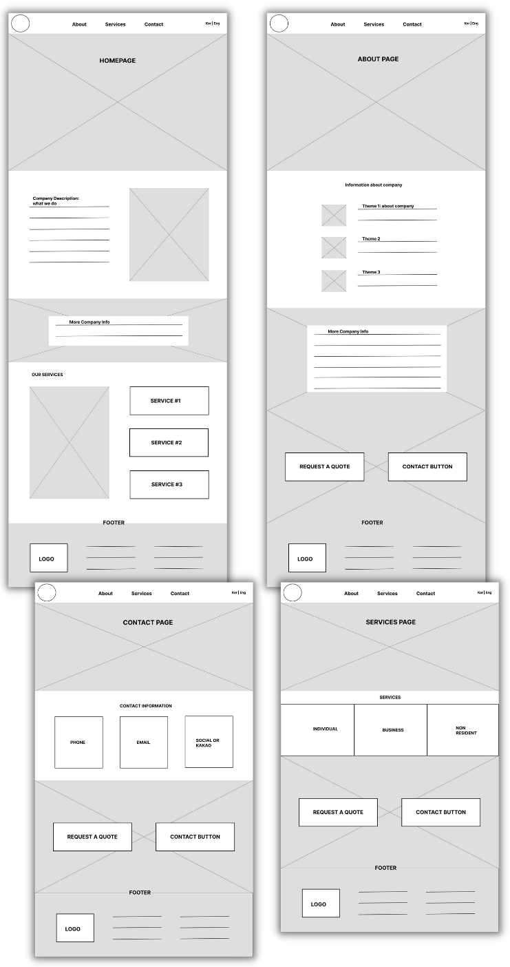
I came up with low fidelity wireframes to discuss the layout and
structuring of the website. We realized that the site won't need any sub-category links;
An about, contact, and services page will suffice.
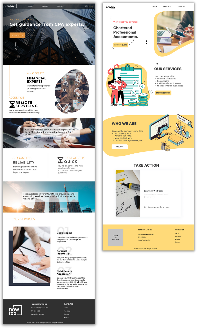
After agreeing on the layout, I provided the client with a few single-page high fidelity
wireframes.
The client liked two of the wireframes:

We decided to go with the design on the left. Upon approval, I coded the website.
The client liked two of the wireframes:

We decided to go with the design on the left. Upon approval, I coded the website.

LEARNING POINTS
This was my first freelance project. Here are a few points I
learned from it:
- Reduce file sizes for loading speed (compress images and videos)
- Especially on mobile devices, reduce the number of videos and animations that may compromise the speed of the website.
- Typography is IMPORTANT. It can make or break the design of a page.


